
Winners Announced!
At our January 2020 Meeting we announced the opposites challenge. And since we are sure that a number of our members had already been working on quilts for the challenge, we wanted to find a way to still host the challenge. Members were asked to submit their quilt submissions online with a title, description and up to three photos, below you can find all of the submissions, displayed in the order the submissions were received.
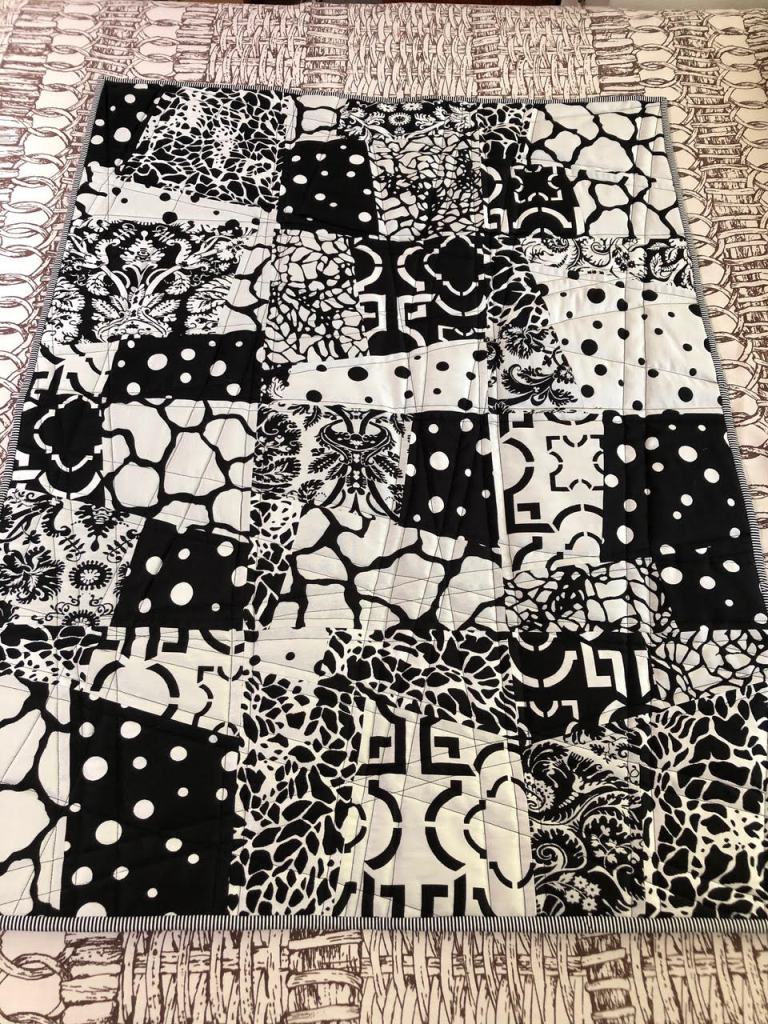

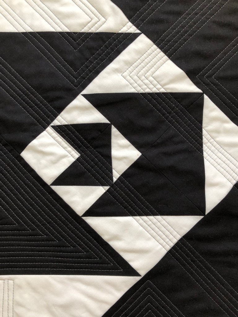
Quilter: Jason Titus
Quilt Name: Opposites
Designer: Jason Titus
Description: Made with reversible fabric – a weave – not a print – each side of each fabric makes the quilt
Opposites Represented: Black on white, white on black
———————————————————————————————————-


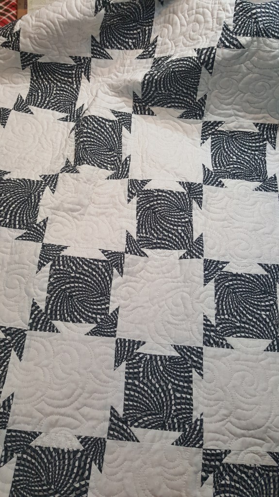
Quilter: Helene Born
Quilt Name: N/A
Designer: Soiree by Amy Ellis
Description: Pieced block (6″) set with white on white. Quilted on my longarm using a panograph.
Opposites Represented: Black & white
———————————————————————————————————-


Quilter: Mary Anne Skorpanich
Quilt Name: Sun and Moon
Designer: Mary Anne Skorpanich
Description: The fabrics are bright and dark, an assortment of metallic prints on black backgrounds. The moon is nested within the sun, representing bright and dark, day and night.
Opposites Represented: bright and dark, day and night, sun and moon. Although the sun and moon can be considered opposites, the light of the sun is needed for the moon to be visible to us, the moon has no illumination of its own.
———————————————————————————————————-
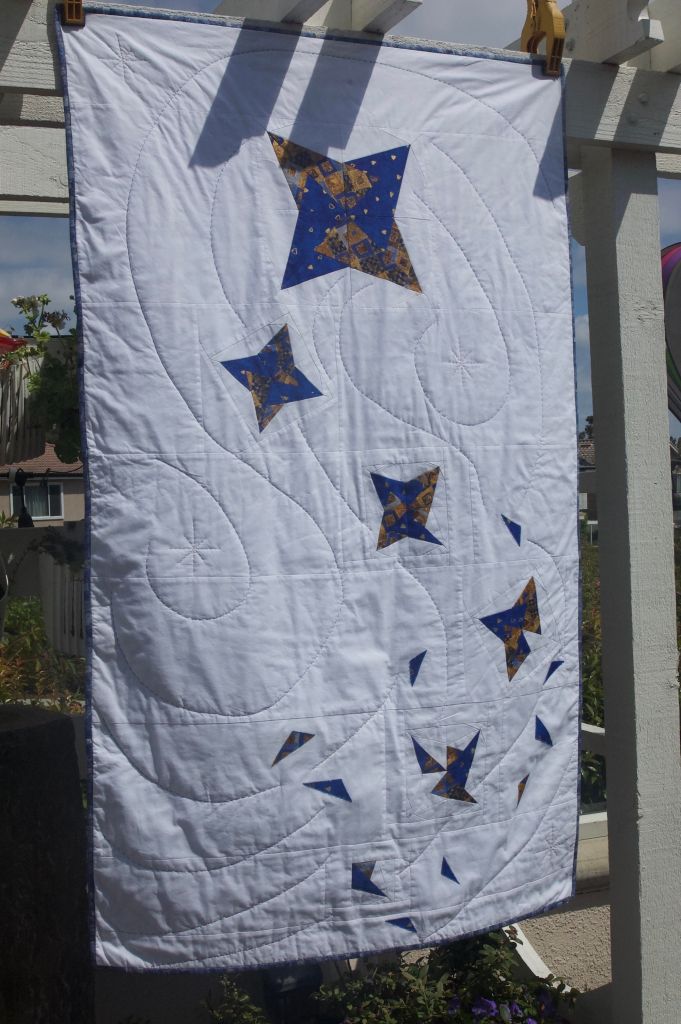

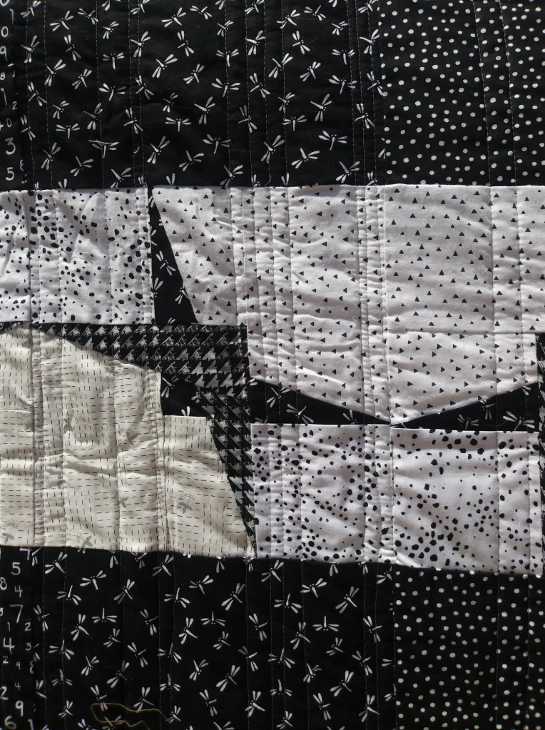
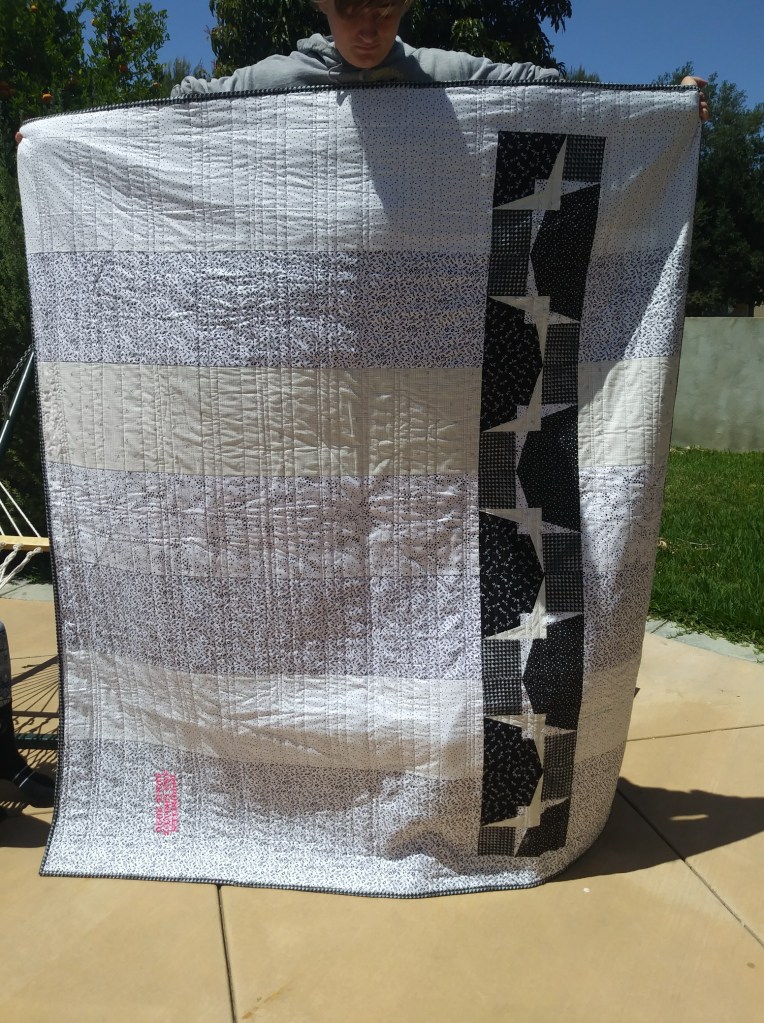
Quilter: Mary O’Bannon
Quilt Name: Star
Designer: Mary O’Bannon
Description: A star falling and disassembling as it falls. I have always wanted to try to figure out a way to make a pattern disassemble. It was a challenge.
Opposites Represented: Whole/Part, Large/Small, Up/Down
———————————————————————————————————-
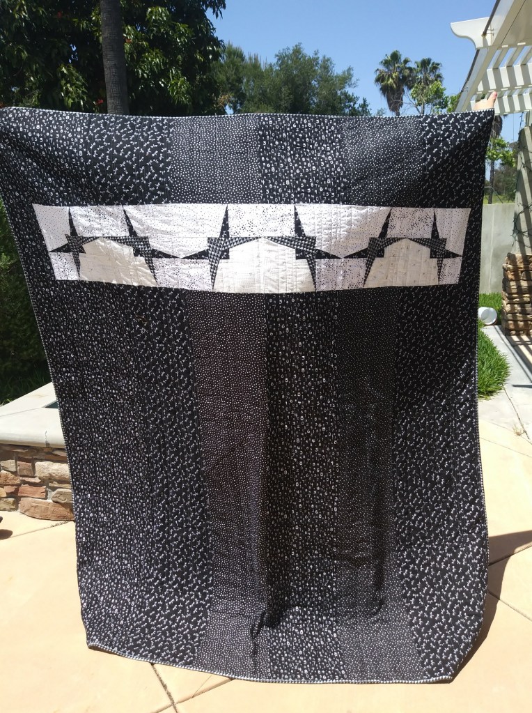
Quilter: Ann Chavez
Quilt Name: Boomerangs
Designer: Ann Chavez
Description: Black and white boomerangs, plus a whole lot more.
Opposites Represented: The front is black and white, two opposite facing boomerangs make horizontal floating panel, quilting is the opposite direction as the boomerang panel, backside white and black, boomerangs run vertically, quilting is perpendicular to boomerangs.
———————————————————————————————————-


Quilter: Lisa Handley
Quilt Name: Improv Color Wheel
Designer: Lisa Handley
Description: I created this quilt to continue my color theory knowledge. I also am working on my improvisational skills.
Opposites Represented: Opposites side of the Color Wheel
———————————————————————————————————-
Winner: Member’s Choice
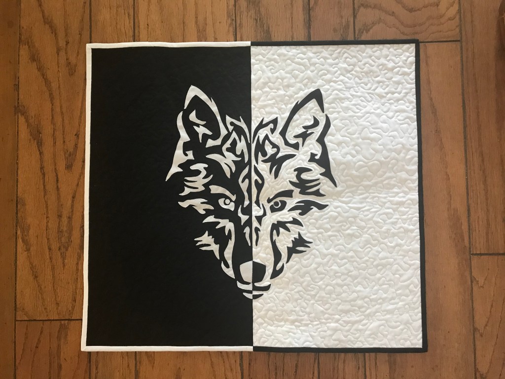
Quilter: Barbara Knapp
Quilt Name: Wolf
Designer: Barbara Knapp
Description: Wolf face divided in half. I don’t know why but it reminds me that there are two sides to every story. Might be given as a gift to a 2020 graduate who has always believed that the wolf is her spirit animal.
Opposites Represented: Black & white, side to side (even the binding is half & half)
———————————————————————————————————-
Winner: best modern design
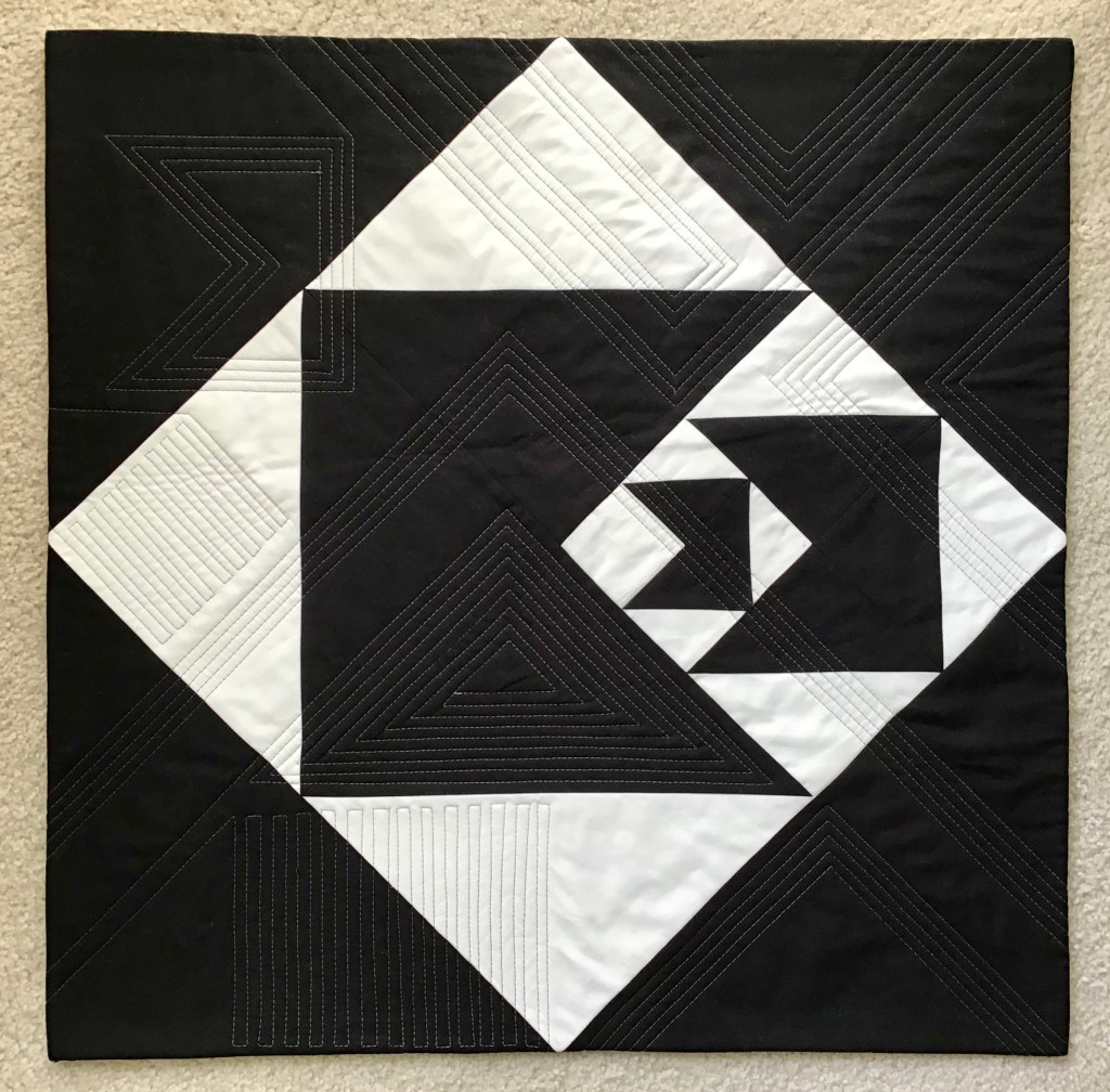
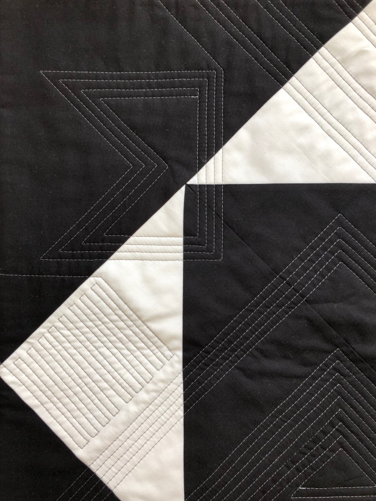
Quilter: Susie Johnson
Quilt Name: Homage
Designer: Geraldo de Barros via his painting, Diagonal Function
Description: This 24”x24” wall hanging is my quilted homage to Geraldo Barros’ 1952 painting, Diagonal Function. His very modern design from 68 years ago; my fabric re-creation with quilting in 2020. This is the first time I’ve drafted my own pattern, and not being a math person, I’m tickled that I figured out the correct proportions. Quilted on my domestic machine – completely improv, which is really out of my wheelhouse – a good challenge for me.
Opposites Represented: Black and white, shapes (horizontal, vertical, diagonal)
———————————————————————————————————-
Winner: Best expression of opposites


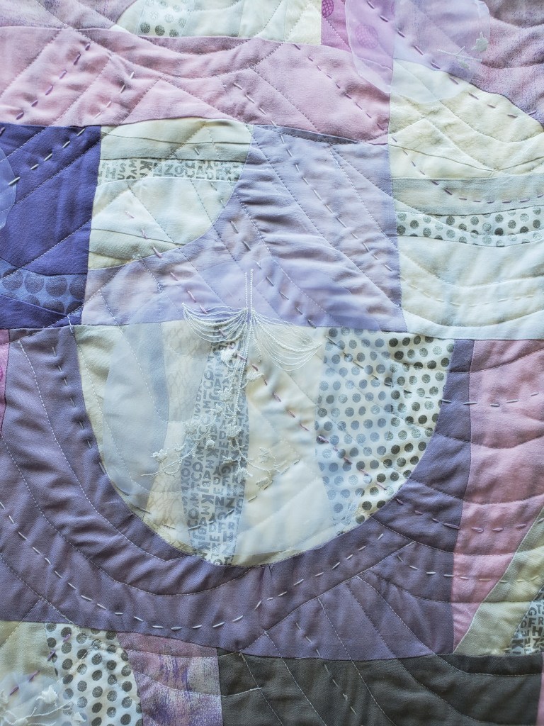
Quilter: Gail Sevilla
Quilt Name: Anger/Calm
Designer: Gail Sevilla
Description: This free form improvisational quilt is representing Calm and Anger. I had only a rough sketch of what I wanted it to look like. I made the Anger section in February. I began making improv triangles of sharp colors for the anger portion. There is a reference to a common swear word in a couple of places too. There is black fabric with text on it that represents harsh, painful words. There is machine quilting of lines at different angles contributing to the chaos of anger.
After a relaxing vacation, I had planned to do the Calm section. Who knew that it became one of least calm times in modern life- Covid time? It took a week or so of just processing so many of the losses before I could tackle sewing again. I began making curved organic shapes in soft lilacs and white to represent Calm. I machine quilted soft, echos of curves, like waves quenching the anger. I included some overlap of the anger colors into the calm. The anger may still reside in smaller pieces and it may rise up in unexpected ways.
I wanted more texture and depth so I added hand embroidery thread. It is knotted and messy in the angry area. The calm area features more big stitch echos of curves. To add more depth to the calm, I also appliqued circles of organza (remnants of my wedding dress) randomly in the calm zone. They are tacked on gently with just a bit of stitching. It is finished with a facing with some semi circles and points reaching out from the edges.
Making this quilt was a consuming project during this difficult time. I am certain I will never forget all the mixed feelings we all dealt with during the months of March and April.
Opposites Represented: Anger and Calm
———————————————————————————————————-

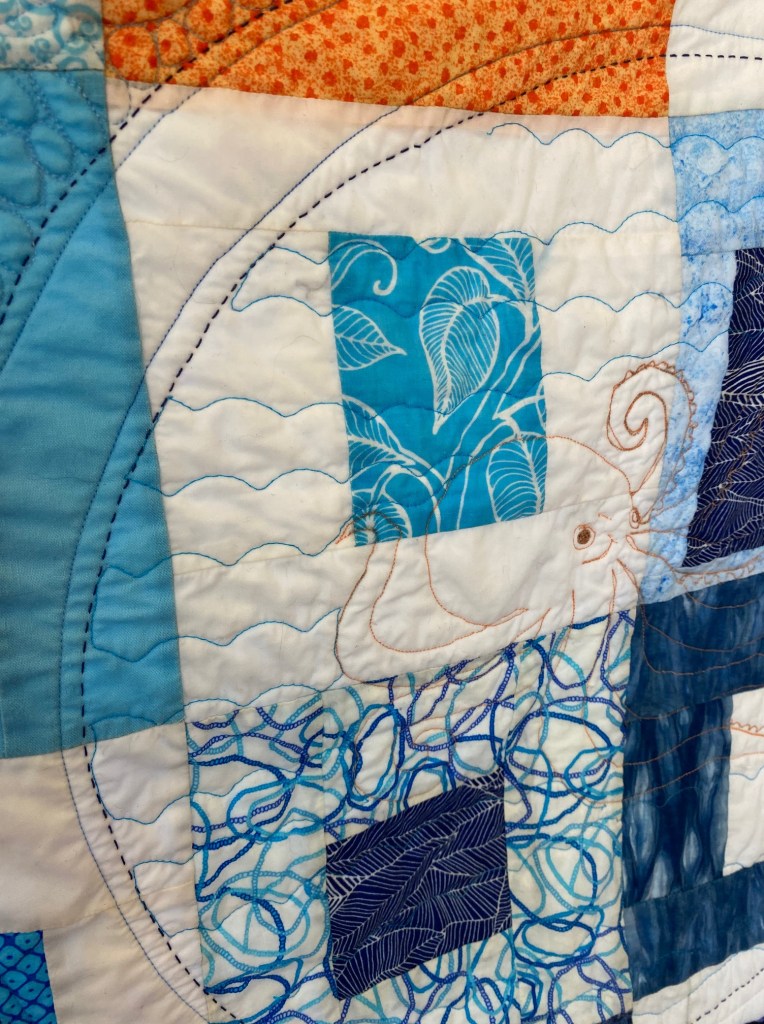
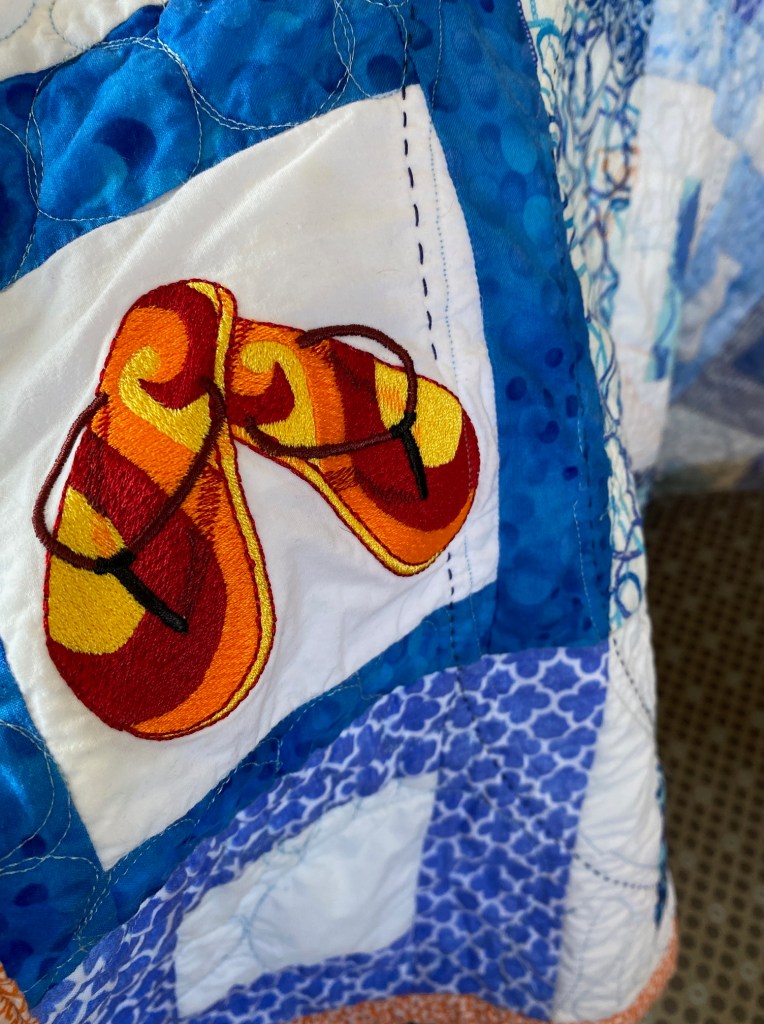
Quilter: Jeri Polizzotto
Quilt Name: Improv by the Sea
Designer: Jeri Polizzotto
Description: I call this quilt “Improv by the Sea.” I loved the theme opposites and really couldn’t stop once I got going. I started with my favorite opposites on the color wheel – blue and orange. The center squares are the improv part, kind of subtle. Then I got going on the quilting and decided to throw in some large circles to contrast with the squares. Inside of those large circles I decided to quilt a sea creature. I love octopuses so I quilted one! I filled in between the large circles with different size (large & small) circles and had fun putting different motifs in a lot of the circles.
One day about 5 years ago I was at my sister in law’s house with my best friend and she had a bunch of embroidered flip flop blocks that she had gotten at a garage sale. We divided them amongst us and said that we would all make quilts out of them. Well I don’t think that any of us ever made quilts out of those blocks! It did however inspire me to get back into quilting after not having done it for more than 10 years (kids got in the way!). I put one of those flip flop blocks in there as kind of a reminder to myself of how much I love quilting and how it’s important in life to do things we love.
Opposites Represented: Blue and orange, circle and square
———————————————————————————————————-
Quilter: Virginia Lucas
Quilt Name: Square Pegs, Round Holes
Designer: Virginia Lucas
Description: Wall Hanging 19” wide x 30” long, raw edge applique
Opposites Represented: Shapes, size of shapes, background color
———————————————————————————————————-


Quilter: Sandra Johnson
Quilt Name: Silver Circles
Designer: Sandra Johnson
Description: Sewn in large circle and applique smaller circles
Opposites Represented: Black and Light Blue
———————————————————————————————————-
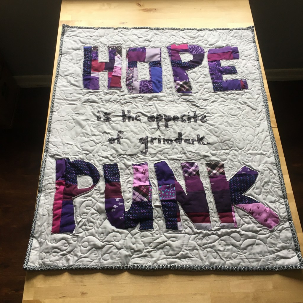

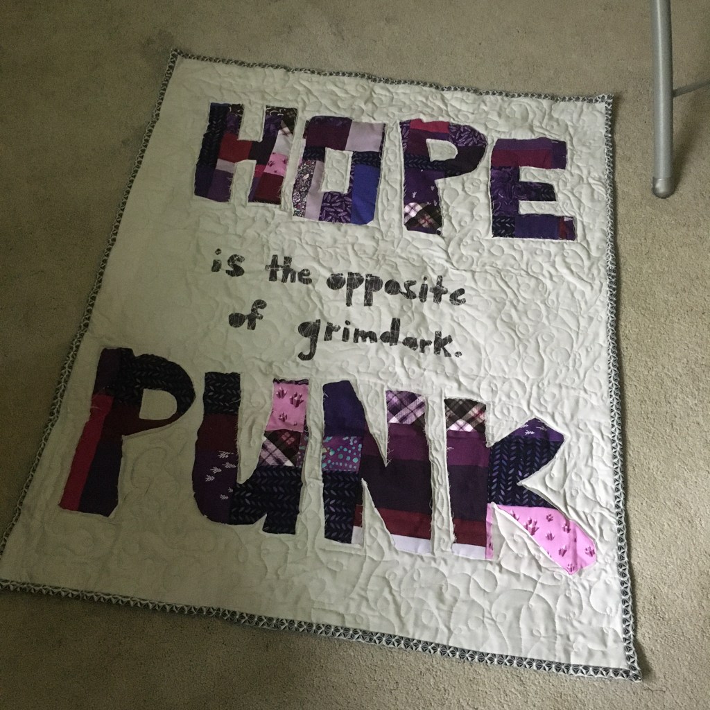
Quilter: Kelly H.
Quilt Name: Hopepunk is the opposite of grimdark. Pass it on.
Designer: Kelly H.
Description: I saw an online post by writer Alexanda Rowland in 2017 that said shortly “The opposite of grimdark is hopepunk. Pass it on.” This short little phrase caught on, was expanded into an essay, and now is a shorthand for a genre of fiction. So I wanted to take the spirit of Hopepunk into quilt form. I improv-ed the letters for Hopepunk in all different shades of purple and did a double-layer of batting beneath it to try for the trapunto effect. I also tried reverse applique for the letters (new technique for me). I did a loopy meander for the quilting and framed it with a dark grey binding. Hopepunk is “It’s about doing the one little thing you can do, even if it’s useless: planting seeds in the midst of the apocalypse, spitting on a wildfire. Hope and strength comes from our bonds with each other, from the actions we take as a community, holding hands in the dark….There are no heroes and no villains. There are just people. That’s hopepunk: Whether the glass is half full or half empty, what matters is that there’s water in that glass. And that’s something worth defending.”
Opposites Represented: I wanted to contract the explosive nature of punk with rich bold colors and have the text pop off quilt by adding extra batting and only quilting around the letters. The purple should pop off the dull grey everywhere else on the quilt.
———————————————————————————————————-

You must be logged in to post a comment.